On average, it takes 5 to 7 impressions for consumers to recognize a business logo. Of course, this number can go up if your logo isn’t easy to digest and remember.
The quicker consumers can recognize your logo, the more likely it is that they’ll remember your brand name. For this reason, it’s incredibly important for you to get your company logo right on the first try.
Are you stumped on creating an outstanding logo? Then here’s a list of 14 really excellent corporate logos you can use as inspiration for your own company’s.
- Apple
Let’s start the list with one of the most iconic logos in the world.
In 1976, Apple first started off with a picture of Isaac Newton sitting beneath an apple tree. It was a great visual, but it was simply too complicated to remember as a logo.
So a year after, Apple switched to the world-famous bitten McIntosh apple. It was initially rainbow-colored to represent their first color display computer. However, it was soon switched to solid colors and chrome for more simplicity.
Google is also a name that practically everyone on the planet knows. But did you know they first started off with the name “BackRub?” Thankfully, they changed it soon after to Google, a much more attractive name.
Back in 1998, the first Google logo was designed very crudely in Times New Roman, plus some coloring and shadowing. Throughout the years, the logo’s evolved quite a bit, but with each iteration, you could still tell it was the same brand.
Today, we have an incredibly simple and clean Google logo that everyone immediately conjures up in their minds whenever they hear the name.
- LG
LG Electronics has a slogan of “life’s good,” which is what the LG stands for. Their logo is incredibly straightforward, with the letters “LG” in big, bold font and gray lettering.
They also have a reddish-circle with the letters LG arranged to look like a smiling face. The circle is there to symbolize endurance and the smiling face is there to reinforce the idea that “life’s good.”
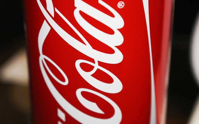
- Coca Cola
Coca Cola’s logo is an example of elegance, with its beautiful swirling cursive font and its red and white color scheme.
But previously, the brand name’s logos weren’t as impressive. They first started out with black caps in a Times New Romanesque font in 1886, with it saying just “COCA-COLA.”
They adopted the cursive font in 1887, then veered away from it for 2 iterations. However, they went back to it in the 1940s and have kept it ever since.
- Nike
Out of all the ideas for your logo, Nike is probably one of the best ones to take a page from.
When you think of Nike, what do you think of? Most likely, their swoosh logo in either black or white (against a black background).
Their logo is extremely simple, but it conveys so many things in just one simple design. The swoosh looks like a checkmark, which signifies accomplishment. But instead of having sharp corners, the checkmark is curved, which makes you think of speed, as the swoop looks like a ski slope.
- Target
This is another brand that has an incredibly simple logo, but is well-known for across the nation (and maybe even across the globe).
Back in the 1960s, Target’s logo first had 3 red and 2 white layers, with a white target in the middle. However, even that design was deemed too complicated, and in the late 1960s, they switched to just 1 layer each and a red target in the middle (which is sometimes flip-flopped for better visibility). Ever since then, this image has been synonymous with the brand.
- FedEx
Looking for another simple yet genius logo design? Then look no further than FedEx’s.
Originally, they used the colors red, purple, and white, and completely spelled out “Federal Express” in caps, with one word on top of one another on a diagonal slant.
But then, they decided to shorten their logo name to FedEx in 1991 and also switched to just “FedEx” in caps. “Fed” was written in dark purple and “ex” was written in red.
It wasn’t until 1994 that we got the modern FedEx design. The company switched to a font similar to bolded Arial and lightened up the colors (purple for “Fed” and orange for “Ex”). In addition, only the F and E were capitalized, and the negative space between the E and x formed an arrow. This conveyed to consumers that they were quick and reliable.
- Toyota
While Toyota’s been around ever since the 1930s, the brand name didn’t get its iconic logo until 1989. The one we all know and love today consists of 3 ovals that overlap one another.
While this looks like a very easy logo to come up with, Toyota’s designers actually spent 5 years developing this logo to make sure it’d be well-received in all across the world.
The 2 small ovals on the interior represent the hearts of the customer and Toyota. Together, they make the letter T. And the outside oval encompasses both ovals to symbolize the world accepting and embracing the brand.
- Mercedes-Benz
Here’s another auto logo for you if you need more inspiration.
Unlike a lot of the logos on this list, Mercedes-Benz doesn’t use any lettering. Instead, people can recognize the logo from a mile away: 3 prongs inside a circle. These prongs represent the land, air, and sea.
However, it wasn’t always this simple; Mercedes-Benz only adopted this image in 1933. A similar logo was created in 1909 where there was just the 3 prongs and no circle, but between 1902 and 1933, the company experimented with many other logos before finally settling on the one we all know today.
- Walmart
If you’re struggling with creating your logo, perhaps you’ll find solace in the fact that even the giants struggle to perfect their logos.
Walmart is a perfect example. Since the 1950s, they’ve gone through at least 13 iterations of their logo. First, they started off with a red “Walton’s,” then adopted the name “Walmart” in 1962.
Ever since, they’ve experimented with different colors and font styles. They even changed the hyphen to a start in 1992. Today, they’ve eliminated the hyphen altogether and have gone with a blue “Walmart” and a yellow asterisk that follows.
- Starbucks
Starbucks has always had a 2-tailed mermaid as their logo. However, they first started with a full-body view of her, which included her bare breasts.
This didn’t go over well with the public, so they redid their logo to be a closer view of the mermaid, with her hair covering her breasts. Starbucks also changed their color scheme from brown and white to green, white, and black.
Today, they’ve slightly tweaked the logo to be simpler. It only involved the colors green and white, and the logo is the mermaid itself, no brand name.
- Shell
You know Shell is a gas company, but do you know why they’re so named? It’s because their business was bringing sea shells to Western countries back in 1833!
Obviously, their logo had always been shells, due to their name and industry specialty. But in 1900, they first started with an overhead view of a clamshell. However, in 1904, the company decided to go with a side view and have kept that stance since then.
In the last century, they’ve experimented with various tweaks to the shell design, with the iconic red and yellow colors being introduced in 1948. Prior to that, the shells were drawn in black and white.
- McDonald’s
It seems like McDonald’s has used those renowned golden arches as their logo for forever, but in reality, they only adopted it in 1960. Prior to that, they had both simple and overly complicated logos.
Thankfully, they found their stride in 1960 and have been improving upon their logo ever since. With each iteration, their logo got simpler and simpler. Today, it’s a simple golden M on a background of red.
- Disney
Disney is a good example of a logo that hasn’t changed too much with time. Ever since its inception in 1937, it’s always been the same font for “Walt Disney.” Considering it’s based on Walt Disney’s actual writing, it was vital the company kept this type font.
In 1985, they added the Disney castle with a light beam. Surprisingly, they decided to make the castle and beam a bit more detailed in 2006.
Use These Excellent Corporate Logos as Inspiration
Now you have a great list of corporate logos that have withstood the tests of time.
As you can see, what they all have in common is they’re all very simplistic. You ever heard the term “KISS,” or “keep it simple, stupid?” Well, in the case of excellent corporate logos, it’s certainly better to underdo it.
When you overdo your logo, you risk it becoming too busy, which can make it harder to remember. So stick to simple shapes and designs, and you’re sure to stick in consumers’ minds.
For more helpful advice and inspiration on running your business, please take a look at our other blog articles.
Readers Might Also Like:
 How Much Do Artists Really Get Paid For Streams – A Financial Breakdown
 5 Attractive Gifts for Men with Beards
 How To Eat Out & Save Money In NYC