The business’s logo is one thing that plays a significant role in marketing, making it an instant hit among people. Today, we will be looking at seven such businesses that became well-known because of their animated logos. These logos were so well-crafted that they affected their business response rates and ended up attracting customers. Logos are considered to be distinctive attention grabbers and can convey intended messages. Just like these brands, you can also create free animated logo for your businesses by searching online for such platforms, which allow you to do so and get the sales going!
Let’s look at some companies that have benefited from their logos without further ado.
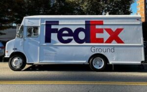
FedEx
It would be unfair not to start with the classic FedEx logo; after all, it has won 40 awards and was named the top logo in Rolling Stones Magazine. FedEx is a company that provides clients and other businesses with a wide range of transportation, e-commerce, and business services.
It’s considered the best design ever made because of the creative use of the space between the last two characters. The FedEx logo is visible to millions of people on their parcels, vehicles, flights, etc. The logo is instantly recognizable and brings back positive connotations.
Elephant Combs
Another company whose logo won awards is Elephant Combs. It is a company based in India that makes combs.
The Elephant Combs logo won the prestigious gold medal at the One Club Awards and was nominated for a Clio Award. A good logo design should be simple, relevant, and easy to remember. The graphic mark combines an elephant and a comb cleverly.
The objective of the hired firm was to make the newly updated logo stand out in the crowd, and so it did. The concept of the logo is so unique, and it fits the idea well. It is perfect if it wins you awards.
Dope
Another winner of the Best Brands Awards is Dope. Dope is a coffee company that provides tasty and high-quality coffee. Even though they didn’t win first place, they did get second place in the Europe and Africa division. Initially, it was a coffee bean, but the registered mark allows you to see a coffee cup.
It also forms a “D” when turned counterclockwise, representing the company’s name, “Dope.” It is clear and elegant, shows what the company does and why, and helps people remember it. This makes it perfect!
Flyence
The Best Brands Awards gave Flyence top honors for being the Best Global Brand in 2021. Fluence is a European flight school that ensures its students are ready to fly. It has one of the most recognized logos, which was made by Aeraki Design.
The logo symbolizes the company’s purpose and what it does exactly. It also represents the company’s trajectory, making a subtle “plane” about to take off, making it aesthetically pleasing.
If we are talking about facts, it should be stated that some of your audience will forget your company’s name but will never forget your logo.
American Library Association
At the Brand Impact Awards 2021, a brand that took home a silver logo was the American Library Association. The Click Design, in charge of rebranding, says that the logo represents America and its history. They also had an open book, which meant that the company was starting a “new chapter” and stood for the library. The creator himself claimed that the name did not mean much to the people, so they renamed the library and developed a new identity, starting with nothing but the logo.
Bikewise
Bikewise, another Best Brand Award recipient, was named Best Brand in the World in 2018. It is a well-established professional motorcycle training company based in the UK. The logo combines a bike and sunglasses, representing everything a motorcyclist or biker needs. The glasses symbolize the customer’s decision to choose the business, while the bike stands for the bike rental service.
Three Leafs
The asterisk, which perfectly represents the Three Leaf’s brand, inspired their logo. The form of the number three in the logo, which corresponds to the brand name, is given by a blade-like structure. Three Leafs intends for the number to demonstrate that they only sell premium tea leaves. The logo shows that the brand aims to provide excellent service while looking modern and classy.
Conclusion
These seven brands did well because of their logos, which greatly affected how much money they made. A strong logo has a big effect on how well a company does because it builds familiarity, recognition, trust, and investment, which leads to more money coming in. If you want to create a strong logo representing your brand’s values, we recommend using a free logo creator like Vista Create. This platform is easy to use, has a fairly smooth user interface, and has several design tools to help you make the best logo for your business.
Readers Might Also Like:

How To Discover Your Shoulder And Back Are Affected By Sitting?
Bill Bellamy To Release Debut Memoir, “Top Billin’: Stories of Laughter, Lessons, and Triumph”
[FIRST LOOK] ALLBLK’s New Series, ‘Hush’ Stars Joyful Drake, Erica Mena & More…
![[FIRST LOOK] Meet the Contestants of Amazon Freevee's 'America's Test Kitchen: The Next Generation'](https://parlemag.com/wp-content/uploads/2022/11/FIRST-LOOK-Meet-the-Contestants-of-Amazon-Freevees-Americas-Test-Kitchen_-The-Next-Generation.jpg)
[FIRST LOOK] Meet the Contestants of Amazon Freevee’s ‘America’s Test Kitchen: The Next Generation’, Hosted By Jeannie Mae Jenkins